Dom Pérignon
Research Studios collaborated with LVMH, the world's largest luxury goods company, to develop the new look for vintage champagne brand Dom Perignon, the cuvée de prestige produced by renowned Champagne house Moët & Chandon.
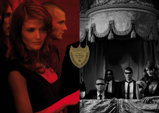
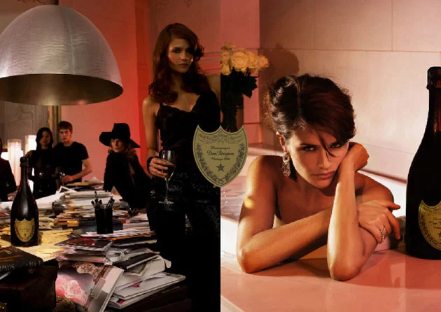
The new brief was to actualize the brand elegance, glamour and appeal while retaining the luxury spirit for which it is well known. We developed a consistent brand structure; it distinguishes each category: Vintage, Rosé and Black Dom and presents clear guidelines to help Dom Pérignon develop additional marketing projects, such as window displays, its print advertisements and promotional materials.
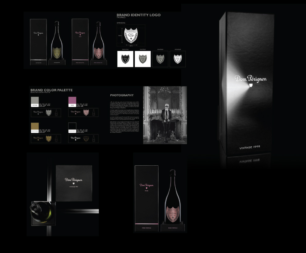
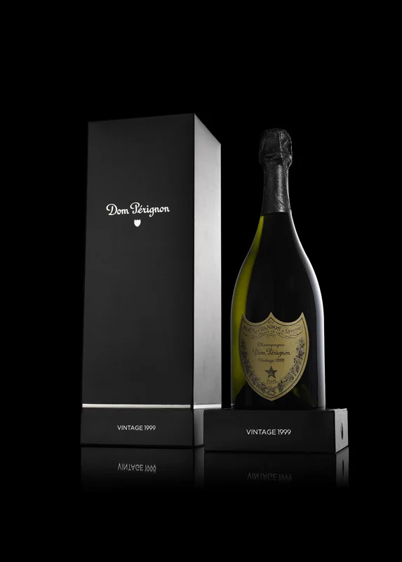
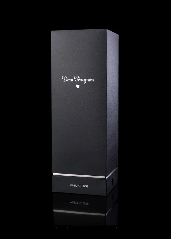
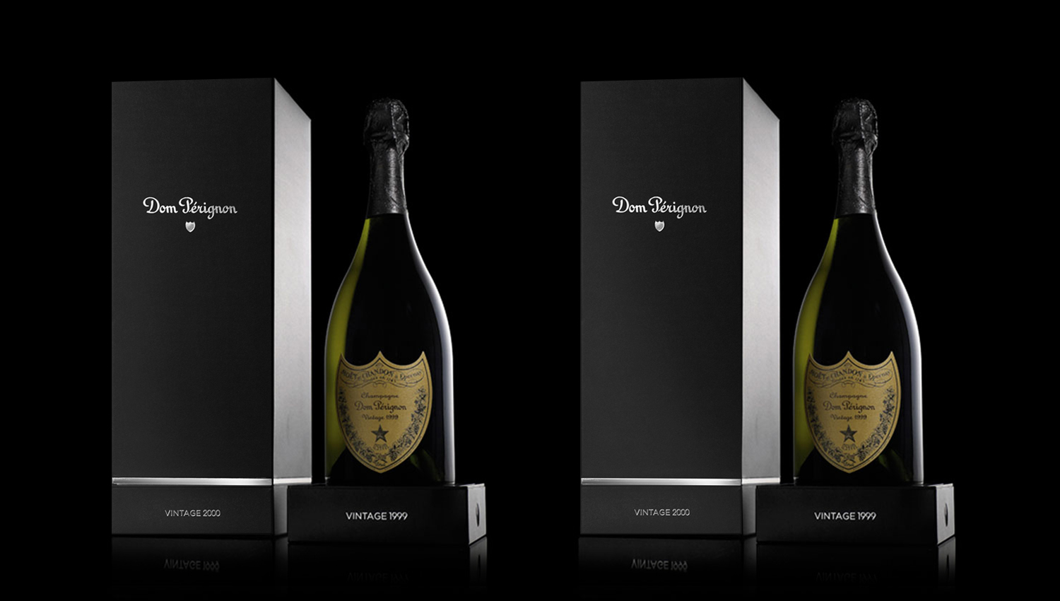
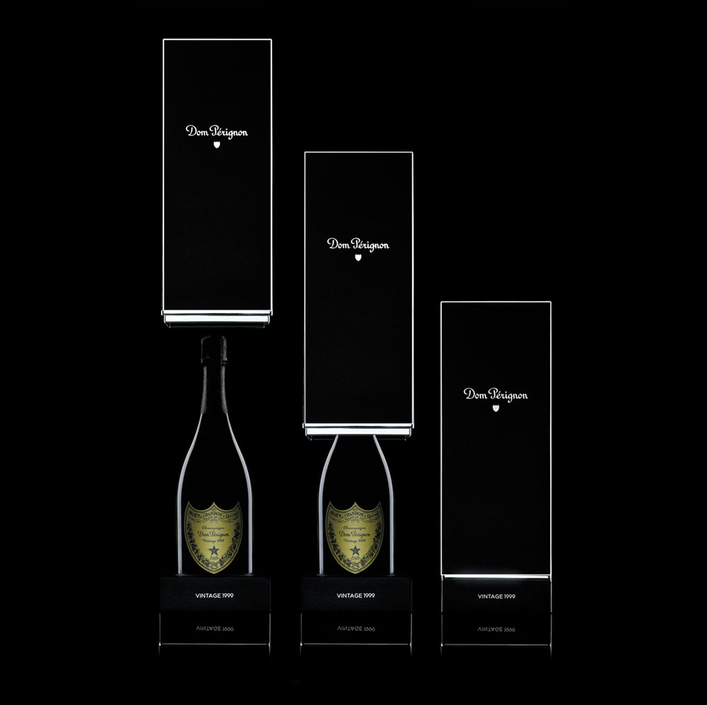
But the key element to change the general perception of the brand was the packaging. We developed a unique format to fulfil the new strategy. It implied a shift from the traditional horizontal ‘chest’ packs to a vertically opening matt black monolith. The new format increases standout among competitor brands in the very contended shelf real state.
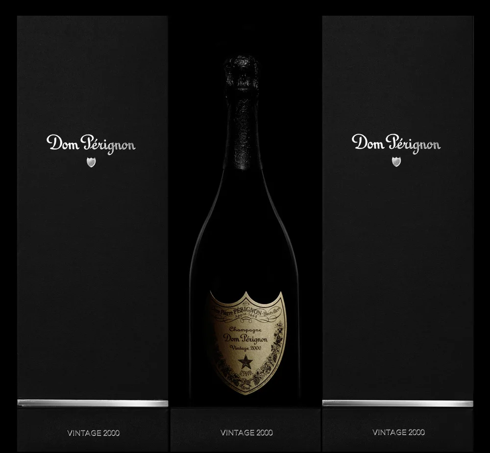
This new packaging required more than one year to develop and get the weight and feel exactly right. Careful attention was needed to get the characteristic latch open sound, and the unique paper was a bespoke production dyed from the block. The original Dom Pérignon logo and bottle shape remain untouched.
"There was a perception of Dom Pérignon as a slightly old-fashioned gentleman's champagne or a Beverly Hills party drink, so we have used some subtle repositioning to move it into a more modern space”. NB